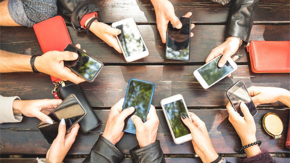
Muchas aplicaciones de redes sociales solicitan permiso para acceder y utilizar tu ubicación y otros datos personales, pero sólo a veces te avisan de ello.
Por desgracia, muchas de estas aplicaciones utilizan la extracción de datos para ofrecerte publicidad. La mejor manera de protegerse es leer las condiciones de servicio de cada aplicación antes de descargarla.
Los que llevan tiempo en Internet se habrán dado cuenta de que Facebook utiliza tus datos para crear anuncios más eficaces. Su complejo algoritmo determina qué contenido aparecerá en tu sección de noticias en función de factores como el tiempo de permanencia, el índice de participación, los «me gusta» de la página y las publicaciones, entre otros datos.
Este algoritmo permite a la red social anticiparse a tus intereses futuros, ofreciéndote contenidos adaptados a ti. Esto puede ir desde una foto de tu querida mascota hasta el último episodio de tu serie favorita o incluso una recomendación para un servicio de suscripción al que estás considerando unirte.
También te habrás dado cuenta de que Facebook te ofrece anuncios de productos que comentas con amigos y familiares o que has expresado interés en comprar. De nuevo, esto puede dar la impresión de que Facebook te espía, aunque el gigante tecnológico lo ha negado repetidamente.
Facebook no sólo utiliza tus noticias para saber dónde estás; también tiene otras herramientas de recopilación de datos que pueden revelar mucho sobre ti. Supongamos que te preocupa la cantidad de datos que recopilan sobre ti. En ese caso, hay medidas sencillas que puedes tomar para ayudar a limitar su recopilación de información personal.
Limitar datos
Una opción es desactivar la función «Servicios de localización» de la aplicación, que permite a Facebook rastrear tu ubicación. Puedes hacerlo en la configuración de tu teléfono o dentro de la aplicación de Facebook.
Otra forma de limitar la cantidad de datos que Facebook recopila es utilizar bloqueadores de anuncios. Estos bloqueadores se descargan gratuitamente del App Store de tu teléfono y te ayudan a bloquear la publicidad dirigida.
Instalar y mantener estos bloqueadores de anuncios puede requerir cierto esfuerzo, pero la tranquilidad que proporcionan merece la pena. Si no te sientes seguro haciéndolo, lo mejor sería eliminar tu cuenta de Facebook.
Si decides abandonar Facebook, recuerda que ya no tendrás acceso a muchas de las funciones de sus aplicaciones, como Messenger e Instagram. Además, ya no podrás compartir fotos y vídeos en tu cronología. No obstante, todavía hay formas de acceder a tu perfil y comunicarte con tus amigos en Facebook.
Instagram es una aplicación para compartir fotos que permite a los usuarios añadir filtros, pies de foto y hashtags. Propiedad de Facebook, el servicio publica esas imágenes en su red social.
Se puede utilizar una amplia selección de herramientas de retoque fotográfico para ajustar el brillo, el contraste, la saturación y la nitidez de una fotografía. Entre las funciones más populares están los efectos manuales de inclinación, viñeta y difuminado.
Por desgracia, estas funciones sólo están disponibles en dispositivos iOS y Android. Puedes desactivar estas funciones a través de la configuración de tu dispositivo o descargar una aplicación de terceros para bloquearlas por completo.
Instagram puede espiarte a través de las cookies.
Esto permite a la empresa controlar tus hábitos de navegación, los enlaces en los que haces clic y los términos de búsqueda que introduces.
Puedes ver cuántos datos tiene Instagram sobre ti iniciando sesión en la aplicación y accediendo a Configuración > Permisos. Desde ahí, tienes la opción de concederles o no acceso a tu micrófono y otros datos.
Además, hay otras formas de limitar cómo Instagram recopila tu información. Una de ellas es desactivar la aplicación para que no vea los contactos; puedes hacerlo desmarcando la opción Conectar contactos en su menú de Ajustes.
Otra forma de limitar el seguimiento que Instagram hace de ti es desactivando los servicios de localización. Por defecto, la aplicación recopila tu ubicación cuando haces o publicas una foto o un vídeo. Esto puede bloquearse en los ajustes de tu teléfono activando Sólo servicios de localización o desactivándolos.
Estos controles son solo temporales, pero pueden ser útiles para asegurarte de que tanto Instagram y facebook no te está rastreando. Son solo algunas maneras de hackear Facebook e Instagram, por asi decirlo ya que su interface está diseñado para que sea complicada su modificación.
Los usuarios de Instagram han denunciado que la plataforma escucha y graba en secreto sus conversaciones. Aunque esto parece un poco espeluznante, la empresa matriz Facebook niega estas afirmaciones.
Buenas noticias: si lo deseas, puedes solicitar a Instagram que elimine tus datos, también tienes la opción de descargar todos tus datos. Este proceso puede tardar hasta 30 días. Después de recibir una notificación y un enlace de correo electrónico con todos tus datos – fotos y vídeos incluidos, así como mensajes, comentarios y otra información – ¡ya estás listo para descargarlo todo!
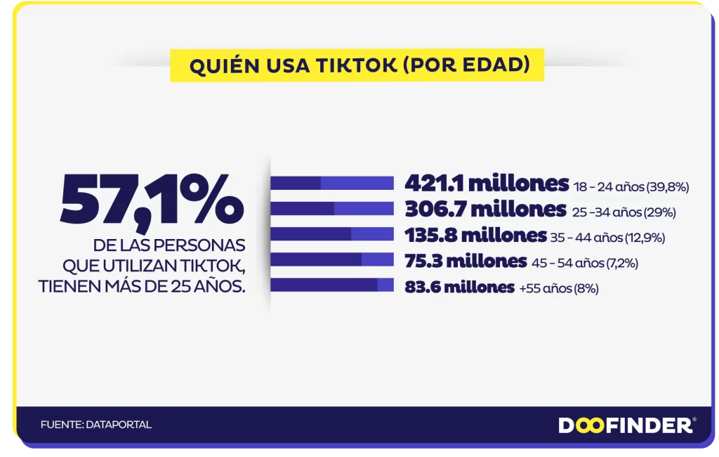
TikTok
Facebook, Instagram y Snapchat son aplicaciones de redes sociales de renombre con importantes bases de usuarios. Pero una estrella emergente está conquistando el mundo: TikTok. Una aplicación para compartir vídeos que se ha convertido rápidamente en una de las más descargadas y de mayor rendimiento del mercado.
Al igual que otras plataformas de redes sociales, TikTok recopila datos sobre ti. Esto incluye el tipo de dispositivo y la dirección IP, qué contenido ves y durante cuánto tiempo, otras aplicaciones utilizadas, historial de búsqueda, y mucho más.
TikTok utiliza estos datos para hacer recomendaciones y ofrecer contenidos que mantienen a los usuarios comprometidos con la aplicación. Además, ayuda a determinar qué anuncios mostrar y cómo mejorar la eficacia de los anuncios.
TikTok también rastrea tu actividad de navegación a través de una extensión del navegador instalada en cada sitio web que visitas. Esto permite a la empresa recopilar un amplio historial de cada página web visitada, página por página.
Para evitarlo, ve a Configuración y Privacidad, luego a Personalización de Anuncios, y desmarca «Uso de actividad fuera de TikTok para segmentación de anuncios». Sin embargo, ten en cuenta que otras aplicaciones o sitios web pueden seguir rastreándote cuando haces otras cosas fuera de la app.
Control parental
TikTok también proporciona controles parentales para limitar el tiempo que sus hijos pasan en la aplicación, lo que pueden ver y lo que se puede hacer con sus cuentas. Estas opciones incluyen el Modo Restringido, que reduce el contenido para adultos, y el Modo de Seguridad Familiar, que empareja tu cuenta con la de tu hijo y te permite controlar todos los ajustes juntos.
A pesar de estas salvaguardas, es esencial recordar que los niños que utilizan la aplicación pueden necesitar ser más maduros para gestionar los riesgos potenciales. Además, dado que gran parte del contenido que se ofrece se basa en música y vídeo, puede resultar difícil para los usuarios más jóvenes distinguir entre material apropiado e inapropiado.
Se han denunciado casos de depredadores sexuales que se han puesto en contacto con menores a través de TikTok, exponiéndolos potencialmente a contenidos inapropiados. TikTok está trabajando duro para combatir este problema. Aun así, siempre es mejor asegurarse de que los niños tienen la edad adecuada antes de permitirles usar la aplicación.
WhatsApp es una de las aplicaciones de redes sociales más populares del mundo, con dos mil millones de usuarios activos en todo el mundo y cien millones de mensajes enviados diariamente. Su uso es gratuito para todo el mundo y permite enviar y recibir mensajes de texto, fotos, vídeos y llamadas, lo que la convierte en una de las aplicaciones más seguras, ya que cifra todos los datos para protegerlos de piratas informáticos o agencias de espionaje.
Sin embargo, es esencial ser consciente de que, a pesar de las medidas de seguridad de WhatsApp, la gente puede espiarte. Por ejemplo, si lo utilizas con frecuencia, alguien podría instalar un programa espía en tu teléfono para controlar las conversaciones y los mensajes.
Los programas espía son fáciles de instalar en tu teléfono y se activan sin que te des cuenta. Pueden rastrear toda la información que se teclea en el teléfono, incluso grabar tu contraseña para que un pirata informático pueda entrar en tu cuenta.
Una señal de que te están vigilando es que la batería se agote rápidamente. Esto puede deberse a que las aplicaciones espía que se ejecutan en segundo plano consumen demasiada energía del hardware del teléfono.
Si tu teléfono empieza a calentarse mientras usas WhatsApp, podría indicar que alguien está instalando software espía. Esto puede hacer que la batería se agote mucho más rápido de lo habitual debido al aumento de la producción de calor.
Riesgo
Esto supone un problema importante, sobre todo para quienes dependen de WhatsApp para comunicarse con sus jefes u otras empresas. Compartir información confidencial con un tercero podría poner en riesgo su empresa y sus datos.
Además, si le preocupa que sus hijos o jóvenes utilicen WhatsApp, asegúrese de que no sufren acoso o intimidación en línea y de que no pasan demasiado tiempo chateando con sus teléfonos. Esto podría provocar problemas de salud como falta de sueño, fatiga visual y depresión.
Para evitar que te espíen en tu cuenta de WhatsApp, lo mejor es cambiar la contraseña y activar la verificación en dos pasos. De este modo, sólo quienes tengan acceso a tu contraseña podrán ver tu cuenta. También es aconsejable comprobar los contactos para ver si se ha producido alguna modificación a causa de las actividades de un pirata informático.

 En ausencia de contacto físico, decir que la práctica del «caming» entra dentro de la prostitución «implica una ampliación de la definición» de esta práctica, según el alto tribunal.